


As the world’s Identity company, Okta is constantly growing our innovative, independent Identity solutions. Since we acquired Auth0 in 2021, everything — from our audience to our product offering — has expanded. And we are now reflecting that evolution in our visual system.
Today, we have two complementary product lines — Customer Identity Cloud and Workforce Identity Cloud. To better tell that story, we’re excited to introduce new icons for each!
New icons
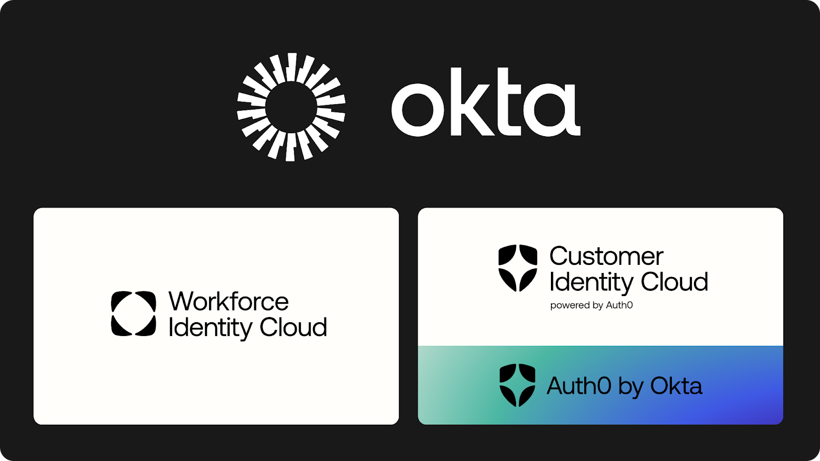
The biggest update is on the right side of this graphic, where you see Customer Identity Cloud. Here's what it all means:
- “Okta” is one company — The World’s Identity Company.
- “Okta Workforce Identity Cloud” is our flagship IAM offering. Its icon alludes to the way you can bring together disparate technologies that enable your people to do their best work, all while creating a safe perimeter.
- “Okta Customer Identity Cloud, powered by Auth0” is our flagship CIAM offering. Its icon is an evolution of the Auth0 logo, and alludes to the way you can bring together amazing experiences that are personalized to the individual, all while protecting their Identity. It carries the Okta brand promise of enterprise-level scale, support, and expertise.
- “Auth0 by Okta” is the technology that powers Customer Identity Cloud. Developers will continue to see this name in the code and APIs, as well as developer resources and tooling. We use the same icon as Customer Identity Cloud.
Note: Because Customer Identity Cloud and Auth0 by Okta are the same technology, you’ll likely encounter both names.
Why the change?
The product experience is still the one you know and love, but we’re introducing new icons for two reasons:
1. To aid user navigation
Customer Identity Cloud and Workforce Identity Cloud comprehensively solve every Identity use case, which more and more organizations are realizing the value of bringing together.
As such, we need to help audiences navigate and quickly distinguish between information for one Cloud versus the other. For example, we may use these icons in content feeds to “tag” Cloud-specific resources, or in technical diagrams to show how each Cloud solves different Identity challenges.
2. To reflect our strategy and the relationship between Okta and Auth0
Since Okta acquired Auth0 in 2021, we’ve been integrating our teams and technologies.
With the new wordmark and icon, we’re reflecting how the Auth0 technology is an integral part of Okta’s success. These updates evolve the Auth0 by Okta logo and wordmark to use the Okta font and rounded shapes.
This new icon brings Auth0’s heritage forward into its place as a foundational technology of Okta and its flagship product line — Okta Customer Identity Cloud.
Most importantly, let’s also call out what is not changing — we have not changed any URLs, APIs, nor code libraries. “Auth0 by Okta” is still the same platform that you know and love, and the Auth0 name remains.
What to expect
You’ll notice changes to display names and icons throughout the experience and in communications. As we update things over the coming months, you may encounter both the old and new visuals. We appreciate your patience as we change these elements on a rolling basis.
What you need to do
If you’re a customer, you do not need to do anything. There won’t be any interruptions to services based on these changes.
If you’re a partner who needs these icons to update your co-marketing materials, please contact partners@okta.com.


