You Had Me at Hello: Developing Great Login and Registration
Transcript
Details
Claire Hunsaker: All right, good morning, everybody. My name is Claire Hunsaker. I'll be your Masters of Ceremonies for the morning portion of the App Dev track. I lead developer marketing here at Okta and before Okta I was the head of marketing at Stormpath. It's a really exciting day for API products here. We are making a whole bunch of announcements, and I think that really focusing on both developer experience and customer experience is going to be a theme that you hear over, and over, and over again coming out of Oktane. So it's exciting to introduce a lot of new things.
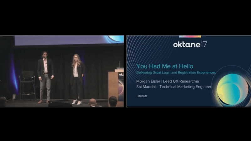
Today, we have Sai Maddali and Morgan Eisler, who are going to be talking about login and registration. So, it's You Had Me at Hello: Delivering Great Login and Registration Experience. So welcome them.
Morgan Eisler: Okay.
Sai Maddali: Great. How's everyone doing today? Good.
Morgan Eisler: Well said. Good morning.
Sai Maddali: Well, today we're going to talk about You Had Me at Hello: Delivering Great Login and Registration Experiences, and we're going to approach this talk from a design perspective and we hope that at the end of the talk, we'll leave you with some design knowledge and also some interesting problems and solutions to ponder about as you go through your different sessions today and tomorrow. My name is Sai Maddali, and I'm one of the technical marketing managers for SSO here at Okta, and SSO is everything that your end user touches, so that's a sign-in widget, the end user dashboard, federations and also directories.
I have here Morgan with me. She's our lead UX researcher like Claire said, and I'll let her dive into the talk.
Morgan Eisler: Hi. So, I lead UX research at Okta and that is part of product and design, and product and design covers all of our products at Okta. So, all the things. But, just to take a 30,000 foot view of ... well, let's try the clicker again. Nope. Oh. Something's trying to update. Technical difficulties.
All right. Let's try again. Nope.
Claire Hunsaker: I'll run AD. You just tell me when to advance.
Morgan Eisler: Okay. Go for it.
Claire Hunsaker: There we go.
Morgan Eisler: Okay. Okay, I'm so sorry. I'm not going to experiment. Can't help myself.
If we take a 30,000 foot view of what we're going to talk about today, we're going to talk about why we're talking about this stuff, so why is your login and registration a critical experience, and why do we care so much about it, how usability and security are related and not necessarily mutually exclusive, reducing friction so we want to pay attention to all those metrics, like conversion that are so important to us and we can follow some design and usability principles to help those things and Sai's going to take us through some new features and roadmap items that I think you'll find are really exciting.
So, why are registration and login important? They are the front door to whatever you've built: your portal, your application ... If you're here in App Dev, you probably make really cool stuff, it's got awesome features that you spent a lot of time building and you going to get people in that front door as soon as possible to start using your stuff. But we don't want to ignore the front door. So, if you spent a lot of money, time and money, developing your product, it's kind of like a house, you want to pay attention to the whole thing.
Sai Maddali: Sorry.
Morgan Eisler: Bless you.
Good, I'm glad you laughed. So, we don't want to neglect this front door. And like Todd mentioned in his keynote this morning, we want customer experiences that are delightful and secure. Right?
So, 72% of developers, according to Google research, are unhappy with the login experience they offer their users right now. And 54% percent of users will bounce out of a registration flow according to a Blue research. Yeah, I see some big eyes. This is a sad number. This is a huge opportunity for acquisition and conversion, so we want to pay attention to this and maybe you're not an auth expert, maybe you've never built registration before from scratch or on top of anything else, so we're going to go through some design principles that can help you fix this number a little bit.
We also want our front door to be locked; 64% of adults in the United States have experienced a data breach so they know it can happen, and the average cost of a data breach in 2017, according to IBM's research is $3,620,000. So, people know that their records can be stolen and it's really expensive for us when those records are stolen. So we want to make sure that our login and registration flows are secure. We'll talk a little bit about that later.
So, here we go. You had me at hello. I don't know if anyone recognizes Jerry McGuire, the film here, but we want to have our users at hello. Your login and registration is your opportunity for a first impression. Cognitive science tells us that first impressions are really persistent. They're hard to change even in the face of new data. So, if someone's first impression of your product is a difficult experience, it doesn't actually bode well for things like retention. So, we want to get 'em at hello.
But before we get too deep into this, Sai mentioned we're going to take this in a design lens and I want to unpack a few terms that maybe feel mystical to people or might be commonly misunderstood. When you think about design, maybe you think about something like, in this picture, this is Okta, white boarding, people sketching, people wearing glasses, room, remote people, maybe you think about someone who went to design school, an interior decorator, someone who makes fine art ...
Those are all flavors of designers, but when talking about products that we work on at Okta, we're talking about product designers. And what that means is that product designers consider three big areas when they design a solution. And that solution has to consider business needs: what do we want people to do, what kind of actions and metrics are we watching, and we also have to consider what those users want to do, what kind of features of are they looking for, how do they want to use your product. And then we also have technical considerations: limitations, can we actually make this?
So, product design actually bridges all three of those business, user and technology and creates and tests a design solution. So, yeah, the end product is that really pretty mock that you might get sent over to engineering, but the process behind it is really rigorous. And design for design's sake is something that we would consider art in our line of work. That the button is there for a reason because it has a purpose and it has a purpose where it is and the color it is, not just because we like blue.
So, this is just an important thing to think about, and we do that within user experience. And user experience is actually the ecosystem of all of the touch points that a person can have with your company. So that includes support, your website, all of your products, your app, so we think about all of those things when we consider user experience. So, putting that out there.
So now we're going to move into usability and security and how they are related. I think a lot of people feel that usability and security can be mutually exclusive, you can't have a good experience with a lot of security. We're going to talk about how that's not exactly true, but first I want you to chew on this. "Many Americans do not trust modern institutions to protect their personal data --- even as they frequently neglect cybersecurity best practices in their own personal lives." How many studies have you heard where password one was the most popular password last year? Yeah. Right? Funny. So, people don't trust you with their data and they're not going to help you protect it on top of that. So that's why we have all these security best practices.
Best practices are changing, so the NIST Digital Identity Guidelines were updated in June, and Bill Burr, the author of the original spec says, "Much of what I did I now regret." So, some of the things that really stood out to us, they're recommending making passwords easy to use so longer free form passwords, more secure easier for people to remember than the standard eight character. And passwords should not expire arbitrarily. So, what they're saying now is, if you have these long free form secure passwords, and you don't have a reason to believe that they've been compromised, there's no reason to change them every 90 days or every 30 days. They're also saying to prevent attackers from resetting passwords, to do away with security questions and to make sure for second factor authentication, you're using something with push instead of SMS as SMS is easily intercepted.
And I know we might not all rush out tomorrow and change everything we've built and update these things, but if you want to stay on the cutting edge of best practices, you can see the link here to everything on GitHub and there's a lot of cool information out there you can check out.
So, flow should be easy to use and it should be secure. The way in which you implement these common security practices really matters for your end users. So this is where usability relates to security. You can make it more usable depending on how you implement the same best practice, so, if we're talking about second factor authentication, is easier with push than it is with a token that people have to keep up with and can't lose, or something that you have to copy and paste or switch between your app and wherever you're entering your code. Hardware is a lot easier to remember than a password, so if you can use something like a fingerprint or facial recognition in lieu of a password or as a second factor, then it's easier, right? You can't lose your fingerprints as easily as you forget a password.
And this is another thing that really comes down to usability, only collecting the information you absolutely need when you put people into a flow for password reset or account information retrieval. I'm going to take you through why that can feel so frustrating.
So here I am, united.com, I forgot my MileagePlus number and I need it to log in. I know we all love United right now, but ... So, you can see here, "Please complete one of the following." I know it's hard to see. I don't have a laser, but it's in bold there. And we have radio button options, and radio buttons in an interface means single select, right? I shouldn't be able to check all these boxes. So I as a user have this expectation that I click 'Email,' I enter my email address and hit 'Continue' and I'm going to be off to the races. But what happened is it threw me all these errors and this means one of two things. One, maybe it's a bug. Maybe it's supposed to work this way, but it doesn't. I'm still frustrated. Or two, they actually need all of this information in order to provide me with this number, because it's sensitive, but they haven't set up my expectations correctly and no matter what I'm already kind of mad. I don't really want to fill this out right now.
Boom. I just became a statistic. Maybe I'm never going to come back, maybe I'm going to come back later and maybe I'm just going to be really mad at United. Versus, I went to the 'Reset my password' on Trulia and I still had an active browser session and I clicked 'Reset password.' They prefilled my email. Boom.
So the way in which you implement flows really matters to people. Those extra clicks, those extra errors, those extra steps, as much as we can streamline them people are more likely to actually finish or to not open that help desk ticket or to not just bounce and give up entirely.
So, Sai's going to take us through another example that has to do with native mobile apps.
Sai Maddali: Great. Thank you, Morgan. Can you guys hear me? Good. So Morgan talked in detail about web applications, but what about native mobile apps? I think there's far too many bad experiences on native mobile applications as well, so over the next couple of slides I'm going to walk you through a story where I'm going to show you different examples of using webviews and browsers and you make the decision as to what's more usable and also what's more secure.
So, for a second here, let me put on my traveler head and travel back in time to about six months and I'm preparing for the eclipse so I download this travel application that has a 'Log in with Facebook' button. Easy and simple, one click login, so I say let me log in with Facebook. So I'm redirected to Facebook where I input my username and password. You can notice here how this is taking place on a browser, because it has a URL button and also a 'Done' button and it clearly shows the user that, oh, hey, I'm on Facebook. So I log in the OAuth consent happens and the travel app receives all my information.
Great. Now I can book my flight. So, fast forward six months, I'm in Portland and I want to buy some food. So I download this food app, which also luckily has Facebook. One-click login, great. And this also takes place on a browser. It's on Facebook, the OAauth consent happens, I'm easily logged in. Now I can get my food. Life's good.
A few weeks later, because I go on this trip with my friends, I want to split all my expenses, so I download this expense app, which also has 'Log in with Facebook.' Nice. But you can notice how the experience is a little different. It's not in a browser any more. It's within this embedded view. It's a subtle but very important, because there's no session stored and it's not within the shared browser, I'm not logged in automatically. I'm being forced to log in again, right? Because this entire transaction is happening within the context of this one app.
So I'm logged in again, not a big deal, just one app. So now I can split my expenses. But a few days later I want to edit all the pictures I took this eclipse, so I download this mobile photo edit app, which also has Facebook login. That's nice, but even this one is using webviews. How frustrating, right? So I'm being forced to log in again but Bob is way more patient than I am, so he logs in and he's finally in. Are you guys with me, or was that boring?
Exactly. Right. So, just like I walked you in that story, webviews create for really bad conversion and Google estimates that nearly 50% of all users in the consumer flow for registration abandon it. But most enterprise users really have that business need so they put up with it. And on top of that they also create for really bad security practices and this is why Google blocked all OAuth requests coming from webviews earlier this year. But most other social providers recommend against using them but they still don't have any particular stance.
You can see how you can extrapolate this out and apply this to various other social providers or the apps that you're building, because they introduce so much unnecessary friction for your end users, both from a usability and also security standpoint. So I highly recommend that you guys check out our AppAuth libraries for iOS and Android. AppAuth is our Google libraries for building authentication into your native mobile apps, and we just became official contributions for them and they follow industry best standards for all the patterns and best practices for building native mobile apps.
Morgan Eisler: Thanks, Sai. Continuing in the vein of reducing friction, and again, reducing friction makes it more likely that our users are going to complete the task they're trying to do. They're going to create an account, they're not going to leave. Or they're going to be able to successfully create an account without bothering you with a support question. So, in usability we have heuristics that we follow. They're like rules of thumb. So these are practices and ideas that you can apply directly to building your own registration and login flows to ensure that people can do what they're trying to do.
The first one is the visibility of system status. The system should always keep users informed about what is going on through appropriate feedback within a reasonable time. What that's really saying is that your app or your interface is having a conversation with the end user. So, when your service stops talking to people, they're confused or they might feel ignored. If they don't know what to do next, they're likely to leave or open that support ticket.
I'll give you a more concrete example. This used to be Okta's multi-factor authentication intercept window. And what that means is this is the thing that would pop up when you had to use another factor to log in to Okta. And you can see the pink arrow pointing to the 'Remember me' checkbox, and the 'Remember me' was static text. It just said remember me. And on the Okta side, this was a security optimization. We were like, "You know what? Hackers and attackers are not going to see any information about the underlying multi-factor authentication policy in this interface."
The problem was the users didn't, either. So, users logging in on Monday morning log in to Okta, get prompted for multi-factor authentication and check 'Remember me.' Think to yourself if you check 'Remember me' on a website, how long are you expecting it to remember you for? Forever. Maybe at least a week or two, but then these folks are logging in on Tuesday morning and getting hit with an MFA request. "Oh. Oh. I got it. It's broken. So I need to tell my IT folks it's broken," and they felt the need to tell us that it was broken, so we got a lot, like, ongoing noise, almost, about how we had a bug and instead it had been a security optimization on our site.
But after all that feedback, that optimization wasn't worth it, because we were creating this false expectation for people that was really frustrating, so we changed it and you can follow the pink arrow down so now the factor lifetime is 10 days on the policy side and that's what we're telling our and user. So we're creating an expectation that actually is fulfilled. So clearly communicating to our end users means they know what to expect and they're not going to be frustrated with the system. So system visibility is giving people enough information to inform their own expectations so that you meet them. That's an important thing to do.
We also want to give good error messages, so we want to help users recover, diagnose, recognize errors. So that means that they should be in plain language, try not to just give a code, precisely indicate the problem and then constructively suggest a solution. So, sign in failed. This is another security optimization that's pretty hard for people, because I don't know what the problem is. I know that it failed, but I don't know why or what to do about it. Do I have an account, did I even make an account? Did I have a typo in my email? Is it the right email? Do I have the right password for this email? Did I mistype my password? Is it the right password?
Now the user is in a place of having to troubleshoot, and maybe for some of us it's no big deal and we just work through some of our standard credentials or we have them stored in a password keeper. But a lot of people get here and hop out because it's not completely necessary for them to go through this flow right now, they're not sure how long it's going to take them, it can feel pretty frustrating.
So here we have a usability optimization. "The email address that you've entered doesn't match any account. Sign up for an account." In plain language, here's the problem and here's how you can fix it and there's a link right here to sign up for Facebook. So, this is a much more helpful error message for an end user.
But even better than writing good error messages, preventing error messages, preventing error states from happening. So we want to prevent that problem from occurring in the first place. We want to eliminate error prone conditions or when we know that they're there, when someone's about to perform an expensive action, we give them that confirmation option. "Are you sure you want to deprovision 900 users?" "Are you sure you want to wipe your cellphone?" "This action cannot be undone."
An example here in registration and login, in the first one, what's helpful here is that I have the password complexity requirements up front. So we're preventing an error here because I already know my password requirements instead of having to guess and then getting an error that says I don't have a symbol or something like that. So that's helpful. And they have these helpful little green tick marks that appear as I'm typing and making sure I hit all those requirements. But, you know what, I'm in a hurry and that blue 'Create account' button is calling me and it's really easy to skip over the fact that I've missed a check mark. And now I've got an error.
Whereas on the second example, the password complexity requirements are much closer to where I'm typing, which is helpful, it's easier for me to scan but the best part is that that next button in the bottom right corner is grayed out, which means I can't submit until I'm going to be successful. And that's what error prevention is about. We want people to stay where they are until we're sure they can be successful and prevent those errors that can feel pretty frustrating.
So, another thing you can do that Sai took us through is social login. People have to enter their credentials less often, there's less chance of typos and frustration. We do support this. Sai's going to talk about that later, but this is the new developer.okta.com website, so if you haven't seen it yet I would take a look.
So, now we're at a point where it's, like, great, it works, people can use it, it's not hard to use. Does it have to look nice? How important is that visual design? I'm going to ask you, instead, how likely you would be to give this company your credit card information without doing a Google search first to see if it's legit. And despite this amazing animation, the answer is probably no, unless you're trolling me. Visual design does matter; 74% of users make their decision on how credible your product or service is based on the visual design of your website overall. So it's really important. This is how people decide if you're legit.
So we want to make sure that our fonts are the same, that they're the same sizes, that we have a nice color scheme, so this is something to pay attention to not because it just looks pretty but because the visual appeal gives us a business benefit of credibility. And on top of that credibility, cognitive science research shows us that visually appealing things are perceived as better. So if it's visually appealing, it feels easier to use. It feels faster. It feels like the company has invested time and money and I'm using a good thing. So we do want to pay attention to this, because it matters for our business.
Giving another example, users also base their trust of a service on visual design. So, here are two examples from Fidelity, these are actually two log ins to two different financial services at two different URLs. But I have the same green, the exact shade. I have the same logo. I have two pages that look like they could be design twins. And that gives me the confidence to feel like no one is spoofing me. I am on the real deal Fidelity page and this is where I'm supposed to be. If things are inconsistent, you kind of get that, whoa, whoa, wait, wait, wait, wait, wait. Is this right thing? Do I need to go back and click that button again? Is this real? Are they actually connected? So visual design gives us a lot of confidence, that consistency.
So color's also important. We want things to be readable for people. You might be having a little trouble reading these blue links on the page. The contrast ratios are important for color. You want people to discern the text from the background. So we have a color contrast checker you can use. Ratios, color ratios are math and you can learn about that if you want, we have some links for you. Also, be kind to everyone of all ages and try to make your font sizes big enough for people to read.
Don't forget mobile. It's like a side note here, but it shouldn't be a side note in your process, and that's because more and more people are going mobile. We saw in Todd's keynote this morning people spend 10-plus hours a day on mobile devices in this country, 60% of all digital time spent in the United States is on a mobile device, and more than fifty percent of Internet traffic one month last year was on mobile devices. So it's not necessarily a small part of your user base. It's a lot of people who are going to try to access your app or your service on their mobile devices. And so we want to be mobile friendly.
If you want to follow along here, and the first website is the Pennsylvania DMV, 'cause I am originally from Pennsylvania and the second is a California DMV, because now I live in California. One of these websites is mobile friendly and one of them is not. And it's California, because what they've done is actually put in the time in the research to find out which tasks people wanted to accomplish most on their mobile website and they put those tasks upfront in these quick links to make them easy to find and quick to do. Pennsylvania, on the other hand, has made a usable mobile website. I can get around. It's got a hamburger menu. It's sort of usable, but it's not mobile friendly, because we haven't optimized for the tasks that people are trying to accomplish. I have to get rid of all these red boxes. I have to scroll. I have to go digging in a menu that is actually not optimized for mobile. So keep that in mind when you are working on your mobile login and registration experiences as well.
Sai's going to take us through some awesome new features and roadmap items.
Sai Maddali: Great. Thank you.
Morgan covered a lot of great design principles and visual heuristics to keep in mind, and I also talked about native mobile app experience. But I also want to focus on one specific thing here, that's web apps that are accessed on mobile like the DMV example that Morgan just talked about, because I think there's far too many bad experiences out there.
For example, the other day I was helping out my little brother with his math homework, so he gives me his credentials for his online learning portal. So it takes me into this page. It's pretty responsive, but I can't move left or right, so I don't know what those banners are actually saying. Granted, I don't actually need to know what's on there. But still. After a few minutes on the page, I don't really find a login button. Eventually, I find a small link that takes me to this page. Not responsive, I can't even find a link let alone it be responsive. But eventually I find this dropdown at the top. It has no indication whatsoever that that's where I need to go and eventually when I get there, there is a secured login button at the very end. Just bad experiences, and it's really frustrating.
So let's say, because I'm already really frustrated at this, I want to put my developer hat on and say I want to fix this. I want to build something cool. So, like Morgan said, and because login and registration are the front door for your users' experience, I want to turn to Okta and build my login experience. So this is the widget as we know it, and there's really two different contexts for it. It's a sign-in widget that you can download, that you can embed within your app and you can configure however you want, style it however you want, and there's the Okta hosted sign-in page. It's the same widget that you use to log in to your Okta dashboard or your end user dashboard.
I'm going to focus on the latter, the Okta sign-in page that's hosted by Okta, and I'm going to show you a couple of cool features on how you can customize that as an addition to what you've seen in the keynote. If you want to follow me along on this, go to oktane-mobile.herokuapp.com on your web or mobile devices. If not you can just watch the screen.
So I'm going to start off with my Okta dashboard and go to customization. And once you have this feature enabled you'll see a custom sign in page. If I look at preview, and if you look on the app that I put up you'll just see the Okta widget as you know it today. But it's just a good old widget that they use to log in with Okta branding. But I spent some time looking through CSS and styling it for the education app that I want to create for and users. Once I paste that, I have this fully custom branding that I've built that's also responsive on mobile. So you don't have to worry about building a completely separate experience or optimizing it for mobile, but you just have it there.
If I go through my login flow and put my username and password ... I also actually want to make sure that I want to have thirteen characters. Like Morgan mentioned, I want to I want to force my users to use free form long passwords, so it's hard to guess. So let me quickly change that. Quickly go to security and change my password policy. So if I preview again, that's all going to be reflected.
So, when I register again ... Actually, I also want to make sure that it's easier for my users to understand that all these passwords are being validated correctly. So I want to change that to green. So it's as simple as selecting the object, inspecting it, finding the right CSS object for it and changing it to whatever color you want. In this case in hex, so I'm just going to say green. And I copy, go back here, paste that, publish and preview. So when I sign up now it's all going to be green.
It's really, really that simple. And now you can customize it however you want for whatever brand you need. And I'm going to walk you through a couple of other features that we released and what's going to come up on the Okta roadmap, one of the main things is custom URL domains. I'm really, really excited about this. You might have known this as vanity URLs and something you've seen in the keynote demo. These are going to be coming up soon, and vanity URLs it's nothing but you have your own own domain name that you can resolve to based on your Okta Org.
The other one is custom sign-in page that I just showed and also localization in over 15 languages. In addition to that, we also have email headers and custom email design that you can match to fit the brand of your application. But the most exciting part of all, what's coming next right. One of the main things is IdP discovery. As you know, today you can use Okta for your employees, partners or customers, but we're going to take it a step further where you can use Okta in the context of a user's device, network or app and have Okta automatically detect where a user resides. You can also extend it to user attributes, so be that email or any custom attributes defined.
So, as a user I'm coming from network zone A on device B and I have email C. So when I come to Okta and log in with all of these details, Okta's going to automatically figure out where this user's credentials reside and it's going to redirect the user there. It's going to do it without you having to do any work at all. That's going to be coming up soon. If you want to know more about it, we can talk after the talk.
The next one is social authentication. As you know, today we have Facebook, Google, Microsoft and Linked In and soon we're going to add Twitter support and eventually we're going to add generic OAuth 2 support. And the way generic OAuth 2 support works is you can use any provider as long as they're OAuth 2 compliant and input some configuration options like token endpoint and OAuth 2 endpoint and have your user redirect there. So this can be your application, it can be Pinterest, it can be Reddit, it can be whatever you want as long as it support OAuth.
The next one is really around the security story, and this is also on the roadmap and the first thing is passwordless, so giving your user the ability to log into an application based on different factors and without having an email. So this factor can be an SMS, an email or a push notification.
And the next one is common password detection. So based on a million breached passwords we did a frequency analysis and came up with top passwords and once you have this feature enabled your user will not be able to use a password that's frequently used. So if you want to learn more about this, how we're thinking about this and what the timelines are, I suggest you go to Alex Bovee's and Sammy Lane's Security Roadmap. It's happening right after this in Bristlecone 10.
The next one is extending our customization story. So, this is going to be features around bringing your own localization. So, extending out localization further to add a localization engine, so that if you have a language that we don't support, you can upload your own template and have that language supported.
And the next one is policy-driven welcome and enrollment. This is more useful for registration. So if you have custom requirements for how an end user's registration flow should look like, you can customize that based on user attributes or where they're coming from.
To recap everything we talked about, Morgan talked in great detail and length about security best practices and usability best practices to keep in mind around passwords and also visual design, and I covered a lot of stuff on the great new features that we have coming up. As you can see we as Okta are investing a lot of time in this login and registration story to make sure that you provide the best end user experience for your users. So we're going to open it up for any questions, but Morgan and I are also going to hang out in the dev lounge down the hallway near the gaming section. And you can come talk to us there, too.
Morgan Eisler: [inaudible 00:35:14]
Speaker 4: [inaudible 00:35:11]
Morgan Eisler: Sorry. Sorry, we're going to grab a microphone so that the recording catches your question. But we're excited that you have a question.
Speaker 4: Thank you. A question on the custom login. Is that available per application, or is that per Okta Org?
Sai Maddali: Good question. So, that's per Okta Org right now but soon we're going to release functionality so that you can customize the styling on a per app basis.
Speaker 4: Any guidance in terms of timelines?
Sai Maddali: I would say by the end of this year, but I can also confirm that with the PM or that and we can talk after.
Speaker 4: Thank you.
Sai Maddali: Yeah.
Speaker 5: Thank you. When do you think the automatic IdP discovery, domain discovery is going to be released?
Sai Maddali: It's scheduled to go in beta some time in November, and we're going to reach out to you if you're interested. If you're interested, I'll take your details down and reach out to you.
Speaker 6: Can those push notifications also be branded?
Sai Maddali: Push notifications coming from the Okta Verify App?
Speaker 6: Yes.
Sai Maddali: Not yet. But I think the current thinking is there's going to be a white labeled MFA SDK so that you can customize however that experience looks like.
Speaker 7: Is there any restriction code, or how you're going to validate you don't mess up or add malicious code to the custom login screen?
Sai Maddali: Well, it's running with the assumption that you as an admin have full access over your admin dashboard. But if you're talking about injecting custom JavaScript, I think that's going to be limited to if you lose control of your admin dashboard. But beyond that you can just put any JavaScript in there.
Speaker 8: So I have been dinged on [inaudible 00:37:21] before for overly helpful error messages on login pages. Do you have any arguments I should be making to our stakeholders about that or username and enumeration isn't actually an important thing to defend against, or that your access is more important, or you know any color you can add to what you said earlier on that?
Morgan Eisler: Yeah, and I think that depends a little bit on your business. For us we saw that Okta MFA intercept and that security trade-off was no longer more important when we had a business reason to change it, because the volume of support cases and calls we were getting about this being broken made it not worth keeping that security trade-off. So I think if you can make a business case for the better user experience in terms of conversion or in terms of support calls or problems with it. If you have a business where you just have to optimize for security ... Sometimes what we do is when there are certain actions performed, we don't display on the interface. If someone tries to unlock their account and it's already unlocked, we send them an email instead of displaying on the interface that your account is already unlocked. So there might be another way for you to send that helpful information to the user that's outside of the actual interface.
Speaker 9: So along that same vein, a lot of your error messages are canned. Are you looking to make it so we can customize those so they're a little bit more helpful so we can describe what the policy is? Sometimes like you have a MFA policy that comes up and says, "Login denied," and there's no information given to the user.
Sai Maddali: Good question. I think most of that is defined on the back end, but I know we're thinking around the story of being able to customize your error messages to not only fit your brand, but how you can customize them for your end users. As for timeline, I don't have a good timeline on that, but I know that's a story we're thinking around.
Morgan Eisler: It's a fair question.
Speaker 10: On the end of localization, talking about the email templates that get generated, I noticed that the SMS has the ability to get [inaudible 00:39:34] translation for an SMS messages, are you guys supporting or is there a plan to support multiple languages for the existing email templates?
Sai Maddali: So, multiple languages as in, as a user I can select what I want and have the email be based on that?
Speaker 10: Yeah, so, if I have a registration or a password reset email, sending that to either an English user or a Spanish speaking user, 'cause today in the interface I see that we have the singular template for that, kind of negates the ability to support multiple languages.
Sai Maddali: I think, today that should be dependent on the user input and using macros you can figure out what type of email to send the user, but I think eventually we'll include some kind of automatic detection to say, oh the user chose a specific language and we're going to automatically send an email in that language to that end user.
Speaker 10: Thank you.
Speaker 11: For the customizable registration flows, are you guys looking into you know potentially adding approvals, so if you can customize it can you add approval so [crosstalk 00:40:38]
Sai Maddali: Yeah. Access request approval workflow is something that's on the roadmap too. I don't have a good timeline for that either, but a couple of things around that same story that we're going to come out with are things like progressive profiling and account linking, so it's part of a larger story. The initial thing is just to make sure that you as an admin can provide self-service registration for your user. But eventually we're going to give you more admin controls over time. You can expect that over the next year.
Claire Hunsaker: Okay. That's all we have time for today. I just want to thank Morgan and Sai for a fantastic presentation.
A couple of quick PSAs, they're going to be hanging out in the developer lounge, which is under the escalators. There's all sorts of things over there including a whole bunch of our developer advocates to talk to and a lot of our experts on the App Dev side. There's also a copy, and I noticed a lot of people light up in this audience when we mentioned OAuth 2. So we have a great book that we've just put out in partnership with Aaron Parecki and it's OAuth 2 Simplified. You can go pick up a free copy in the developer lounge. Lots of good technical information to help you understand the very complicated OAuth protocol.
Anyway, thank you guys very much. Great job. Thanks for coming.
Morgan Eisler: Thank you.
Registration and login are the front door to your application or portal, and the part of the application your users will experience first, and most frequently. In this talk, we'll discuss ways to design and deliver great UX to drive better adoption.